创建一个点击展开的 FAB
A Floating Action Button (FAB) is a round button that floats near the bottom right of a content area. This button represents the primary action for the corresponding content, but sometimes, there is no primary action. Instead, there are a few critical actions that the user might take. In this case, you could create an expandable FAB like the one shown in the following figure. When pressed, this expandable FAB spawns multiple, other action buttons. Each button corresponds to one of those critical actions.
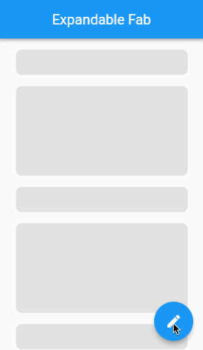
The following animation shows the app’s behavior:
Create an ExpandableFab widget
Start by creating a new stateful widget called ExpandableFab.
This widget displays the primary FAB and coordinates the expansion
and collapse of the other action buttons. The widget takes
in parameters for whether or not the ExpandedFab begins in
the expanded position, what the maximum distance of each action button is,
and a list of children. You’ll use the list later to provide
the other action buttons.
@immutable
class ExpandableFab extends StatefulWidget {
  const ExpandableFab({
    super.key,
    this.initialOpen,
    required this.distance,
    required this.children,
  });

  final bool? initialOpen;
  final double distance;
  final List<Widget> children;

  @override
  State<ExpandableFab> createState() => _ExpandableFabState();
}

class _ExpandableFabState extends State<ExpandableFab> {
  @override
  Widget build(BuildContext context) {
    return const SizedBox();
  }
}
FAB cross-fade
The ExpandableFab displays a blue edit button when collapsed
and a white close button when expanded. When expanding and collapsing,
these two buttons scale and fade between one another.
Implement the expand and collapse cross-fade between the two different FABs.
class _ExpandableFabState extends State<ExpandableFab> {
  bool _open = false;

  @override
  void initState() {
    super.initState();
    _open = widget.initialOpen ?? false;
  }

  void _toggle() {
    setState(() {
      _open = !_open;
    });
  }

  @override
  Widget build(BuildContext context) {
    return SizedBox.expand(
      child: Stack(
        alignment: Alignment.bottomRight,
        clipBehavior: Clip.none,
        children: [
          _buildTapToCloseFab(),
          _buildTapToOpenFab(),
        ],
      ),
    );
  }

  Widget _buildTapToCloseFab() {
    return SizedBox(
      width: 56,
      height: 56,
      child: Center(
        child: Material(
          shape: const CircleBorder(),
          clipBehavior: Clip.antiAlias,
          elevation: 4,
          child: InkWell(
            onTap: _toggle,
            child: Padding(
              padding: const EdgeInsets.all(8),
              child: Icon(
                Icons.close,
                color: Theme.of(context).primaryColor,
              ),
            ),
          ),
        ),
      ),
    );
  }

  Widget _buildTapToOpenFab() {
    return IgnorePointer(
      ignoring: _open,
      child: AnimatedContainer(
        transformAlignment: Alignment.center,
        transform: Matrix4.diagonal3Values(
          _open ? 0.7 : 1.0,
          _open ? 0.7 : 1.0,
          1.0,
        ),
        duration: const Duration(milliseconds: 250),
        curve: const Interval(0.0, 0.5, curve: Curves.easeOut),
        child: AnimatedOpacity(
          opacity: _open ? 0.0 : 1.0,
          curve: const Interval(0.25, 1.0, curve: Curves.easeInOut),
          duration: const Duration(milliseconds: 250),
          child: FloatingActionButton(
            onPressed: _toggle,
            child: const Icon(Icons.create),
          ),
        ),
      ),
    );
  }
}
The open button sits on top of the close button within a Stack,
allowing for the visual appearance of a cross-fade as the top button
appears and disappears.
To achieve the cross-fade animation, the open button uses an
AnimatedContainer with a scale transform and an AnimatedOpacity.
The open button scales down and fades out when the ExpandableFab
goes from collapsed to expanded. Then, the open button scales up
and fades in when the ExpandableFab goes from expanded to collapsed.
You’ll notice that the open button is wrapped with an
IgnorePointer widget. This is because the open button always exists,
even when it’s transparent. Without the IgnorePointer,
the open button always receives the tap event,
even when the close button is visible.
Create an ActionButton widget
Each of the buttons that expand from the ExpandableFab
have the same design. They’re blue circles with white icons.
More precisely, the button background color is the ColorScheme.secondary
color, and the icon color is ColorScheme.onSecondary.
Define a new stateless widget called ActionButton to display
these round buttons.
@immutable
class ActionButton extends StatelessWidget {
  const ActionButton({
    super.key,
    this.onPressed,
    required this.icon,
  });

  final VoidCallback? onPressed;
  final Widget icon;

  @override
  Widget build(BuildContext context) {
    final theme = Theme.of(context);
    return Material(
      shape: const CircleBorder(),
      clipBehavior: Clip.antiAlias,
      color: theme.colorScheme.secondary,
      elevation: 4,
      child: IconButton(
        onPressed: onPressed,
        icon: icon,
        color: theme.colorScheme.onSecondary,
      ),
    );
  }
}
Pass a few instances of this new ActionButton widget into your
ExpandableFab.
floatingActionButton: ExpandableFab(
  distance: 112,
  children: [
    ActionButton(
      onPressed: () => _showAction(context, 0),
      icon: const Icon(Icons.format_size),
    ),
    ActionButton(
      onPressed: () => _showAction(context, 1),
      icon: const Icon(Icons.insert_photo),
    ),
    ActionButton(
      onPressed: () => _showAction(context, 2),
      icon: const Icon(Icons.videocam),
    ),
  ],
),
Expand and collapse the action buttons
The child ActionButtons should fly out from under the open
FAB when expanded. Then, the child ActionButtons should
fly back under the open FAB when collapsed.
This motion requires explicit (x,y) positioning of each
ActionButton and an Animation to choreograph changes to
those (x,y) positions over time.
Introduce an AnimationController and an Animation to
control the rate at which the various ActionButtons expand and collapse.
class _ExpandableFabState extends State<ExpandableFab>
    with SingleTickerProviderStateMixin {
  late final AnimationController _controller;
  late final Animation<double> _expandAnimation;
  bool _open = false;

  @override
  void initState() {
    super.initState();
    _open = widget.initialOpen ?? false;
    _controller = AnimationController(
      value: _open ? 1.0 : 0.0,
      duration: const Duration(milliseconds: 250),
      vsync: this,
    );
    _expandAnimation = CurvedAnimation(
      curve: Curves.fastOutSlowIn,
      reverseCurve: Curves.easeOutQuad,
      parent: _controller,
    );
  }

  @override
  void dispose() {
    _controller.dispose();
    super.dispose();
  }

  void _toggle() {
    setState(() {
      _open = !_open;
      if (_open) {
        _controller.forward();
      } else {
        _controller.reverse();
      }
    });
  }
}
Next, introduce a new stateless widget called _ExpandingActionButton,
and configure this widget to animate and position an individual ActionButton. The ActionButton is provided as a generic Widget called child.
@immutable
class _ExpandingActionButton extends StatelessWidget {
  const _ExpandingActionButton({
    required this.directionInDegrees,
    required this.maxDistance,
    required this.progress,
    required this.child,
  });

  final double directionInDegrees;
  final double maxDistance;
  final Animation<double> progress;
  final Widget child;

  @override
  Widget build(BuildContext context) {
    return AnimatedBuilder(
      animation: progress,
      builder: (context, child) {
        final offset = Offset.fromDirection(
          directionInDegrees * (math.pi / 180.0),
          progress.value * maxDistance,
        );
        return Positioned(
          right: 4.0 + offset.dx,
          bottom: 4.0 + offset.dy,
          child: Transform.rotate(
            angle: (1.0 - progress.value) * math.pi / 2,
            child: child!,
          ),
        );
      },
      child: FadeTransition(
        opacity: progress,
        child: child,
      ),
    );
  }
}
The most important part of _ExpandingActionButton is the
Positioned widget, which positions the child at a specific (x,y)
coordinate within the surrounding Stack.
The AnimatedBuilder causes the Positioned widget to rebuild
every time the animation changes. The FadeTransition widget
orchestrates the appearance and disappearance of each
ActionButton as they expand and collapse, respectively.
Finally, use the new _ExpandingActionButton widget
within the ExpandableFab to complete the exercise.
class _ExpandableFabState extends State<ExpandableFab>
    with SingleTickerProviderStateMixin {
  @override
  Widget build(BuildContext context) {
    return SizedBox.expand(
      child: Stack(
        alignment: Alignment.bottomRight,
        clipBehavior: Clip.none,
        children: [
          _buildTapToCloseFab(),
          ..._buildExpandingActionButtons(),
          _buildTapToOpenFab(),
        ],
      ),
    );
  }

  List<Widget> _buildExpandingActionButtons() {
    final children = <Widget>[];
    final count = widget.children.length;
    final step = 90.0 / (count - 1);
    for (var i = 0, angleInDegrees = 0.0;
        i < count;
        i++, angleInDegrees += step) {
      children.add(
        _ExpandingActionButton(
          directionInDegrees: angleInDegrees,
          maxDistance: widget.distance,
          progress: _expandAnimation,
          child: widget.children[i],
        ),
      );
    }
    return children;
  }
}
Congratulations! You now have an expandable FAB.
Interactive example
Run the app:
- Click the FAB in the lower-right corner, represented with an Edit icon. It fans out to 3 buttons and is itself replaced by a close button, represented by an X.
- Click the close button to see the expanded buttons fly back to the original FAB and the X is replaced by the Edit icon.
- Expand the FAB again, and click on any of the 3 satellite buttons to see a dialog representing that button’s action.
import 'dart:math' as math;

import 'package:flutter/material.dart';

void main() {
  runApp(
    const MaterialApp(
      home: ExampleExpandableFab(),
      debugShowCheckedModeBanner: false,
    ),
  );
}

@immutable
class ExampleExpandableFab extends StatelessWidget {
  static const _actionTitles = ['Create Post', 'Upload Photo', 'Upload Video'];

  const ExampleExpandableFab({super.key});

  void _showAction(BuildContext context, int index) {
    showDialog<void>(
      context: context,
      builder: (context) {
        return AlertDialog(
          content: Text(_actionTitles[index]),
          actions: [
            TextButton(
              onPressed: () => Navigator.of(context).pop(),
              child: const Text('CLOSE'),
            ),
          ],
        );
      },
    );
  }

  @override
  Widget build(BuildContext context) {
    return Scaffold(
      appBar: AppBar(
        title: const Text('Expandable Fab'),
      ),
      body: ListView.builder(
        padding: const EdgeInsets.symmetric(vertical: 8),
        itemCount: 25,
        itemBuilder: (context, index) {
          return FakeItem(isBig: index.isOdd);
        },
      ),
      floatingActionButton: ExpandableFab(
        distance: 112,
        children: [
          ActionButton(
            onPressed: () => _showAction(context, 0),
            icon: const Icon(Icons.format_size),
          ),
          ActionButton(
            onPressed: () => _showAction(context, 1),
            icon: const Icon(Icons.insert_photo),
          ),
          ActionButton(
            onPressed: () => _showAction(context, 2),
            icon: const Icon(Icons.videocam),
          ),
        ],
      ),
    );
  }
}

@immutable
class ExpandableFab extends StatefulWidget {
  const ExpandableFab({
    super.key,
    this.initialOpen,
    required this.distance,
    required this.children,
  });

  final bool? initialOpen;
  final double distance;
  final List<Widget> children;

  @override
  State<ExpandableFab> createState() => _ExpandableFabState();
}

class _ExpandableFabState extends State<ExpandableFab>
    with SingleTickerProviderStateMixin {
  late final AnimationController _controller;
  late final Animation<double> _expandAnimation;
  bool _open = false;

  @override
  void initState() {
    super.initState();
    _open = widget.initialOpen ?? false;
    _controller = AnimationController(
      value: _open ? 1.0 : 0.0,
      duration: const Duration(milliseconds: 250),
      vsync: this,
    );
    _expandAnimation = CurvedAnimation(
      curve: Curves.fastOutSlowIn,
      reverseCurve: Curves.easeOutQuad,
      parent: _controller,
    );
  }

  @override
  void dispose() {
    _controller.dispose();
    super.dispose();
  }

  void _toggle() {
    setState(() {
      _open = !_open;
      if (_open) {
        _controller.forward();
      } else {
        _controller.reverse();
      }
    });
  }

  @override
  Widget build(BuildContext context) {
    return SizedBox.expand(
      child: Stack(
        alignment: Alignment.bottomRight,
        clipBehavior: Clip.none,
        children: [
          _buildTapToCloseFab(),
          ..._buildExpandingActionButtons(),
          _buildTapToOpenFab(),
        ],
      ),
    );
  }

  Widget _buildTapToCloseFab() {
    return SizedBox(
      width: 56,
      height: 56,
      child: Center(
        child: Material(
          shape: const CircleBorder(),
          clipBehavior: Clip.antiAlias,
          elevation: 4,
          child: InkWell(
            onTap: _toggle,
            child: Padding(
              padding: const EdgeInsets.all(8),
              child: Icon(
                Icons.close,
                color: Theme.of(context).primaryColor,
              ),
            ),
          ),
        ),
      ),
    );
  }

  List<Widget> _buildExpandingActionButtons() {
    final children = <Widget>[];
    final count = widget.children.length;
    final step = 90.0 / (count - 1);
    for (var i = 0, angleInDegrees = 0.0;
        i < count;
        i++, angleInDegrees += step) {
      children.add(
        _ExpandingActionButton(
          directionInDegrees: angleInDegrees,
          maxDistance: widget.distance,
          progress: _expandAnimation,
          child: widget.children[i],
        ),
      );
    }
    return children;
  }

  Widget _buildTapToOpenFab() {
    return IgnorePointer(
      ignoring: _open,
      child: AnimatedContainer(
        transformAlignment: Alignment.center,
        transform: Matrix4.diagonal3Values(
          _open ? 0.7 : 1.0,
          _open ? 0.7 : 1.0,
          1.0,
        ),
        duration: const Duration(milliseconds: 250),
        curve: const Interval(0.0, 0.5, curve: Curves.easeOut),
        child: AnimatedOpacity(
          opacity: _open ? 0.0 : 1.0,
          curve: const Interval(0.25, 1.0, curve: Curves.easeInOut),
          duration: const Duration(milliseconds: 250),
          child: FloatingActionButton(
            onPressed: _toggle,
            child: const Icon(Icons.create),
          ),
        ),
      ),
    );
  }
}

@immutable
class _ExpandingActionButton extends StatelessWidget {
  const _ExpandingActionButton({
    required this.directionInDegrees,
    required this.maxDistance,
    required this.progress,
    required this.child,
  });

  final double directionInDegrees;
  final double maxDistance;
  final Animation<double> progress;
  final Widget child;

  @override
  Widget build(BuildContext context) {
    return AnimatedBuilder(
      animation: progress,
      builder: (context, child) {
        final offset = Offset.fromDirection(
          directionInDegrees * (math.pi / 180.0),
          progress.value * maxDistance,
        );
        return Positioned(
          right: 4.0 + offset.dx,
          bottom: 4.0 + offset.dy,
          child: Transform.rotate(
            angle: (1.0 - progress.value) * math.pi / 2,
            child: child!,
          ),
        );
      },
      child: FadeTransition(
        opacity: progress,
        child: child,
      ),
    );
  }
}

@immutable
class ActionButton extends StatelessWidget {
  const ActionButton({
    super.key,
    this.onPressed,
    required this.icon,
  });

  final VoidCallback? onPressed;
  final Widget icon;

  @override
  Widget build(BuildContext context) {
    final theme = Theme.of(context);
    return Material(
      shape: const CircleBorder(),
      clipBehavior: Clip.antiAlias,
      color: theme.colorScheme.secondary,
      elevation: 4,
      child: IconButton(
        onPressed: onPressed,
        icon: icon,
        color: theme.colorScheme.onSecondary,
      ),
    );
  }
}

@immutable
class FakeItem extends StatelessWidget {
  const FakeItem({
    super.key,
    required this.isBig,
  });

  final bool isBig;

  @override
  Widget build(BuildContext context) {
    return Container(
      margin: const EdgeInsets.symmetric(vertical: 8, horizontal: 24),
      height: isBig ? 128 : 36,
      decoration: BoxDecoration(
        borderRadius: const BorderRadius.all(Radius.circular(8)),
        color: Colors.grey.shade300,
      ),
    );
  }
}