
Do not use the Flutter mark or any variant of the Flutter mark in conjunction with the overall name of your application, product, service, or website. Do not alter or use the Flutter mark in a way that may be confusing or misleading, and never use Flutter branding as the most prominent element on your page.
The standard lockup can be used in slide decks and blog posts. It should never be used in-product or in a way that implies that Flutter is endorsing or has built the product.

For lighter backgrounds with overlapping shapes or varied patterns.
For darker background with overlapping shapes or varied patterns when transparency is not available.

For darker background backgrounds with overlapping shapes or varied patterns.

For solid darker backgrounds with high contrasts

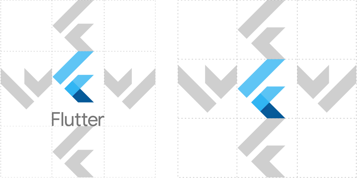
When there is limited horizontal space, a vertical lockup can be used

When there is limited vertical and horizontal space, the logomark can be used by itself without the logotype.

When referring in the context of another app. This includes in blog posts, press interviews, and in the app itself.

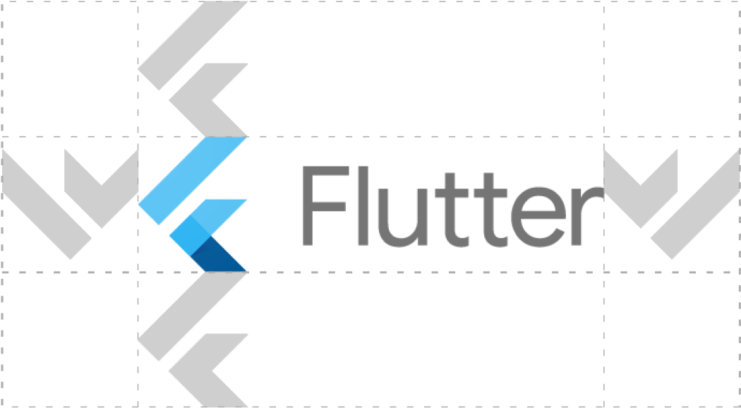
To ensure legibility, the Flutter lockup and icon should sit within an open space. A minimum margin of space equivalent to the height of a single 'F' should always be maintained around the lockup or icon. A greater margin of space should be proved when possible. The logo should never be overlapped or crowded by text or artwork. Additionally the logo should not be linked to other logos or labels. Only approved brand lockups should be used.
The Flutter icon appears off balance when center aligned. When center aligning the icon, use the upper and lower left corners as reference points to provide optical balance.
When using the knockout version of the logo, always ensure foreground and background colors pass WCAG AA accessibility standards. WCAG 2.0 level AA requires a contrast ratio of at least 4.5:1 for normal text and 3:1 for large text. WCAG 2.1 requires a contrast ratio of at least 3:1 for graphics and user interface components.
Turn standard ligatures off when rendering the name 'Flutter' in a headline format. The two 't' characters should remain distinct.


The logo consists of one primary blue and two accent blue colors.
Flutter also has an extended palette used for background colors and other visualizations.
