Flutter 中的布局
Flutter 布局的核心机制是 widgets。在 Flutter 中,几乎所有东西都是 widget —— 甚至布局模型都是 widgets。你在 Flutter 应用程序中看到的图像,图标和文本都是 widgets。此外不能直接看到的也是 widgets,例如用来排列、限制和对齐可见 widgets 的行、列和网格。
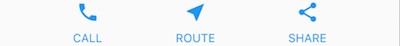
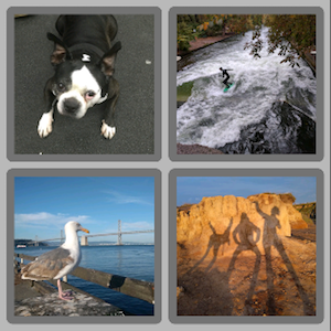
你可以通过组合 widgets 来构建更复杂的 widgets 来创建布局。比如,下面第一个截图上有 3 个图标,每个图标下面都有一个标签:
第二个截图显示了可视布局,可以看到有一排三列,其中每列包含一个图标和一个标签。
以下是这个 UI 的 widget 树形图:
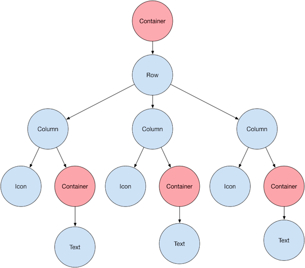
图上大部分应该和你预想的一样,但你可能会疑惑 containers(图上粉色显示的)是什么。
Container 是一个 widget,允许你自定义其子 widget。举几个例子,如果要添加 padding、margin、边框或背景颜色,你就可以用上 Container 了。
在这个例子中,每个 Text widget 都被放在一个 Container 以添加 padding。整个 Row 也被放在一个 Container 中,以便添加 padding。
这个例子其余部分的 UI 由属性控制。通过 Icon 的 color 属性来设置它的颜色,通过 Text.style 属性来设置文字的字体、颜色、字重等等。列和行有一些属性可以让你指定子项垂直或水平的对齐方式以及子项应占用的空间大小。
布局 widget
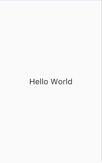
如何在 Flutter 中布局单个 widget?本节将介绍如何创建和显示单个 widget。本节还包括一个简单的 Hello World app 的完整代码。
在 Flutter 中,只需几步就可以在屏幕上显示文本、图标或图像。
1. 选择一个布局 widget
根据你想要对齐或限制可见 widget 的方式从各种 layout widgets 中进行选择,因为这些特性通常会传递它所给包含的 widget。
本例使用将其内容水平和垂直居中的 Center。
2. 创建一个可见 widget
举个例子,创建一个 Text widget:
Text('Hello World'),创建一个 Image widget:
Image.asset(
  'images/lake.jpg',
  fit: BoxFit.cover,
),
创建一个 Icon widget:
Icon(
  Icons.star,
  color: Colors.red[500],
),
3. 将可见 widget 添加到布局 widget
所有布局 widgets 都具有以下任一项:
-
一个
child属性,如果它们只包含一个子项 —— 例如Center和Container -
一个
children属性,如果它们包含多个子项 —— 例如Row、Column、ListView和Stack
将 Text widget 添加进 Center widget:
const Center(
  child: Text('Hello World'),
),
4. 将布局 widget 添加到页面
一个 Flutter app 本身就是一个 widget,大多数 widgets 都有一个 build() 方法,在 app 的 build() 方法中实例化和返回一个 widget 会让它显示出来。
对于 Material app,你可以使用 Scaffold widget,它提供默认的 banner 背景颜色,还有用于添加抽屉、提示条和底部列表弹窗的 API。你可以将 Center widget 直接添加到主页 body 的属性中。
class MyApp extends StatelessWidget {
  const MyApp({super.key});

  @override
  Widget build(BuildContext context) {
    return MaterialApp(
      title: 'Flutter layout demo',
      home: Scaffold(
        appBar: AppBar(
          title: const Text('Flutter layout demo'),
        ),
        body: const Center(
          child: Text('Hello World'),
        ),
      ),
    );
  }
}非 Material apps
对于非 Material app,你可以将 Center widget 添加到 app 的 build() 方法里:
class MyApp extends StatelessWidget {
  const MyApp({super.key});

  @override
  Widget build(BuildContext context) {
    return Container(
      decoration: const BoxDecoration(color: Colors.white),
      child: const Center(
        child: Text(
          'Hello World',
          textDirection: TextDirection.ltr,
          style: TextStyle(
            fontSize: 32,
            color: Colors.black87,
          ),
        ),
      ),
    );
  }
}
默认情况下,非 Material app 不包含 AppBar、标题和背景颜色。如果你希望在非 Material app 中使用这些功能,则必须自己构建它们。以上 app 将背景颜色更改为白色,将文本更改为深灰色来模拟一个 Material app。
横向或纵向布局多个 widgets
最常见的布局模式之一是垂直或水平 widgets。你可以使用 Row widget 水平排列 widgets,使用 Column widget 垂直排列 widgets。
要在 Flutter 中创建行或列,可以将子 widgets 列表添加到
Row 或 Column widget 中。反过来,每个子项本身可以是一行或一列,依此类推。以下示例演示了如何在行或列中嵌套行或列。
这个布局被组织为 Row。这一行包含两个子项:左侧的列和右侧的图像:
左侧列的 widget 树嵌套着行和列。
你将在 嵌套行和列 中实现蛋糕介绍示例的一些布局代码。
对齐 widgets
你可以使用 mainAxisAlignment 和 crossAxisAlignment
属性控制行或列如何对齐其子项。对于一行来说,主轴水平延伸,交叉轴垂直延伸。对于一列来说,主轴垂直延伸,交叉轴水平延伸。
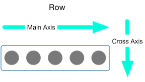
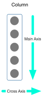
MainAxisAlignment 和 CrossAxisAlignment 这两个枚举提供了很多用于控制对齐的常量。
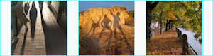
在以下示例中,3 个图像每个都是是 100 像素宽。渲染框(在本例中是整个屏幕)宽度超过 300 像素,因此设置主轴对齐方式为 spaceEvenly 会将空余空间在每个图像之间、之前和之后均匀地划分。
Row(
  mainAxisAlignment: MainAxisAlignment.spaceEvenly,
  children: [
    Image.asset('images/pic1.jpg'),
    Image.asset('images/pic2.jpg'),
    Image.asset('images/pic3.jpg'),
  ],
);
App 源码: row_column
列的工作方式与行的工作方式相同。以下示例展示了包含 3 个图像的列,每个图像的高度为 100 像素。渲染框(在本例中是整个屏幕)高度超过 300 像素,因此设置主轴对齐方式为 spaceEvenly 会将空余空间在每个图像之间、之上和之下均匀地划分。
Column(
  mainAxisAlignment: MainAxisAlignment.spaceEvenly,
  children: [
    Image.asset('images/pic1.jpg'),
    Image.asset('images/pic2.jpg'),
    Image.asset('images/pic3.jpg'),
  ],
);
App 源码: row_column
调整 widgets 大小
当某个布局太大而超出屏幕时,受影响的边缘会出现黄色和黑色条纹图案。这里有一个行太宽的 例子:
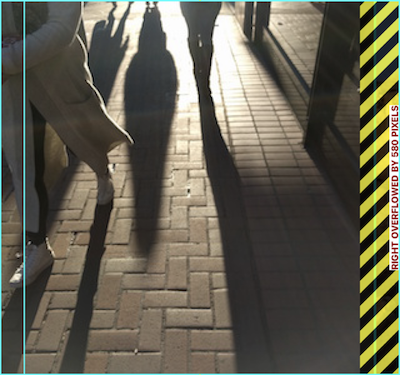
通过使用 Expanded widget,可以调整 widgets 的大小以适合行或列。要修复上一个图像行对其渲染框来说太宽的示例,可以用 Expanded widget 把每个图像包起来。
Row(
  crossAxisAlignment: CrossAxisAlignment.center,
  children: [
    Expanded(
      child: Image.asset('images/pic1.jpg'),
    ),
    Expanded(
      child: Image.asset('images/pic2.jpg'),
    ),
    Expanded(
      child: Image.asset('images/pic3.jpg'),
    ),
  ],
);
App 源码: sizing
也许你想要一个 widget 占用的空间是兄弟项的两倍。为了达到这个效果,可以使用 Expanded widget 的 flex 属性,这是一个用来确定 widget 的弹性系数的整数。默认的弹性系数为 1,以下代码将中间图像的弹性系数设置为 2:
Row(
  crossAxisAlignment: CrossAxisAlignment.center,
  children: [
    Expanded(
      child: Image.asset('images/pic1.jpg'),
    ),
    Expanded(
      flex: 2,
      child: Image.asset('images/pic2.jpg'),
    ),
    Expanded(
      child: Image.asset('images/pic3.jpg'),
    ),
  ],
);
App 源码: sizing
组合 widgets
默认情况下,行或列沿其主轴会占用尽可能多的空间,但如果要将子项紧密组合在一起,请将其 mainAxisSize 设置为 MainAxisSize.min。以下示例使用此属性将星形图标组合在一起。
Row(
  mainAxisSize: MainAxisSize.min,
  children: [
    Icon(Icons.star, color: Colors.green[500]),
    Icon(Icons.star, color: Colors.green[500]),
    Icon(Icons.star, color: Colors.green[500]),
    const Icon(Icons.star, color: Colors.black),
    const Icon(Icons.star, color: Colors.black),
  ],
)
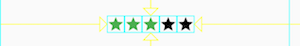
App 源码: pavlova
嵌套行和列
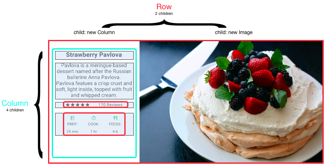
布局框架允许你根据需要在行和列内嵌套行和列。让我们看看以下布局的概述部分的代码:
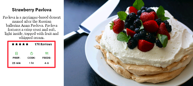
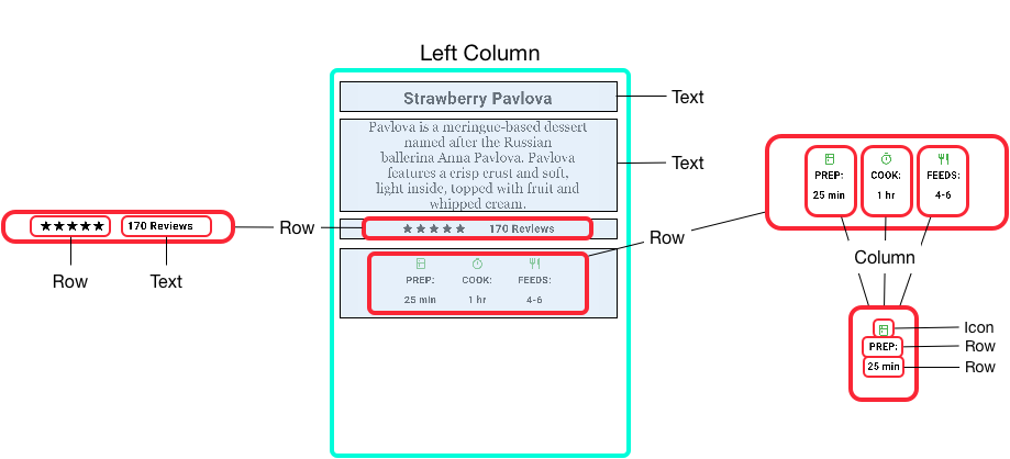
概述的部分实现为两行,评级一行包含五颗星和评论的数量,图标一行包含由图标与文本组成的三列。
以下是评级行的 widget 树形图:
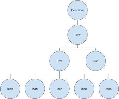
ratings 变量创建了一个行,其中包含较小的由 5 个星形图标和文本组成的一行:
var stars = Row(
  mainAxisSize: MainAxisSize.min,
  children: [
    Icon(Icons.star, color: Colors.green[500]),
    Icon(Icons.star, color: Colors.green[500]),
    Icon(Icons.star, color: Colors.green[500]),
    const Icon(Icons.star, color: Colors.black),
    const Icon(Icons.star, color: Colors.black),
  ],
);

final ratings = Container(
  padding: const EdgeInsets.all(20),
  child: Row(
    mainAxisAlignment: MainAxisAlignment.spaceEvenly,
    children: [
      stars,
      const Text(
        '170 Reviews',
        style: TextStyle(
          color: Colors.black,
          fontWeight: FontWeight.w800,
          fontFamily: 'Roboto',
          letterSpacing: 0.5,
          fontSize: 20,
        ),
      ),
    ],
  ),
);评级行下方的图标行包含 3 列,每列包含一个图标和两行文本,你可以在其 widget 树中看到:
iconList 变量定义了图标行:
const descTextStyle = TextStyle(
  color: Colors.black,
  fontWeight: FontWeight.w800,
  fontFamily: 'Roboto',
  letterSpacing: 0.5,
  fontSize: 18,
  height: 2,
);

// DefaultTextStyle.merge() allows you to create a default text
// style that is inherited by its child and all subsequent children.
final iconList = DefaultTextStyle.merge(
  style: descTextStyle,
  child: Container(
    padding: const EdgeInsets.all(20),
    child: Row(
      mainAxisAlignment: MainAxisAlignment.spaceEvenly,
      children: [
        Column(
          children: [
            Icon(Icons.kitchen, color: Colors.green[500]),
            const Text('PREP:'),
            const Text('25 min'),
          ],
        ),
        Column(
          children: [
            Icon(Icons.timer, color: Colors.green[500]),
            const Text('COOK:'),
            const Text('1 hr'),
          ],
        ),
        Column(
          children: [
            Icon(Icons.restaurant, color: Colors.green[500]),
            const Text('FEEDS:'),
            const Text('4-6'),
          ],
        ),
      ],
    ),
  ),
);
leftColumn 变量包含评级和图标行,以及蛋糕介绍的标题和文本:
final leftColumn = Container(
  padding: const EdgeInsets.fromLTRB(20, 30, 20, 20),
  child: Column(
    children: [
      titleText,
      subTitle,
      ratings,
      iconList,
    ],
  ),
);
左列放置在 Container 中以限制其宽度。最后,UI 由 Card 内的整行(包含左列和图像)构成。
蛋糕图片 来自 Pixabay 网站。你可以使用 Image.network() 从网络上引用图像,但是在本例图像将保存到项目中的一个图像目录中,添加到 pubspec 文件,并使用 Images.asset() 访问。更多信息可以查看文档中关于 添加资源和图片 这一章。
body: Center(
  child: Container(
    margin: const EdgeInsets.fromLTRB(0, 40, 0, 30),
    height: 600,
    child: Card(
      child: Row(
        crossAxisAlignment: CrossAxisAlignment.start,
        children: [
          SizedBox(
            width: 440,
            child: leftColumn,
          ),
          mainImage,
        ],
      ),
    ),
  ),
),App 源码: pavlova
通用布局 widgets
Flutter 有一个丰富的布局 widget 仓库,里面有很多经常会用到的布局 widget。目的是为了让你更快的上手,而不是被一个完整的列表吓跑。关于其他有用的 widget 的信息,可以参考 Widget 目录,或者使用 API 参考文档 中的搜索框。而且,API 文档中的 widget 页面中经常会给出一些关于相似的 widget 哪个会更适合你的建议。
下面的 widget 会分为两类:widgets 库 中的标准 widgets 和 Material 库 中的 widgets。任何 app 都可以使用 widget 库,但是 Material 库中的组件只能在 Material app 中使用。
标准 widgets
-
Container:向 widget 增加 padding、margins、borders、background color 或者其他的“装饰”。 -
GridView:将 widget 展示为一个可滚动的网格。 -
ListView:将 widget 展示为一个可滚动的列表。 -
Stack:将 widget 覆盖在另一个的上面。
Material widgets
Container
许多布局都可以随意的用 Container,它可以将使用了 padding 或者增加了 borders/margins 的 widget 分开。你可以通过将整个布局放到一个 Container 中,并且改变它的背景色或者图片,来改变设备的背景。
摘要 (Container)
-
增加 padding、margins、borders
-
改变背景色或者图片
-
只包含一个子 widget,但是这个子 widget 可以是行、列或者是 widget 树的根 widget
示例 (Container)
这个布局包含一个有两行的列,每行有两张图片。
Container 用来将列的背景色变为浅灰色。
Widget _buildImageColumn() {
  return Container(
    decoration: const BoxDecoration(
      color: Colors.black26,
    ),
    child: Column(
      children: [
        _buildImageRow(1),
        _buildImageRow(3),
      ],
    ),
  );
}
Container 还用来为每个图片添加圆角和外边距:
Widget _buildDecoratedImage(int imageIndex) => Expanded(
      child: Container(
        decoration: BoxDecoration(
          border: Border.all(width: 10, color: Colors.black38),
          borderRadius: const BorderRadius.all(Radius.circular(8)),
        ),
        margin: const EdgeInsets.all(4),
        child: Image.asset('images/pic$imageIndex.jpg'),
      ),
    );

Widget _buildImageRow(int imageIndex) => Row(
      children: [
        _buildDecoratedImage(imageIndex),
        _buildDecoratedImage(imageIndex + 1),
      ],
    );
你可以在 布局构建教程 和 Flutter Gallery
中可以发现更多关于 Container 的例子。
App 源码: container
GridView
使用 GridView 将 widget 作为二维列表展示。
GridView 提供两个预制的列表,或者你可以自定义网格。当 GridView 检测到内容太长而无法适应渲染盒时,它就会自动支持滚动。
摘要 (GridView)
-
在网格中使用 widget
-
当列的内容超出渲染容器的时候,它会自动支持滚动。
-
创建自定义的网格,或者使用下面提供的网格的其中一个:
-
GridView.count允许你制定列的数量 -
GridView.extent允许你制定单元格的最大宽度
-
示例 (GridView)
使用 GridView.count 创建一个网格,它在竖屏模式下有两行,在横屏模式下有三行。可以通过为每个 GridTile 设置 footer 属性来创建标题。
Dart 代码: Flutter Gallery 中的 grid_list_demo.dart
Widget _buildGrid() => GridView.extent(
    maxCrossAxisExtent: 150,
    padding: const EdgeInsets.all(4),
    mainAxisSpacing: 4,
    crossAxisSpacing: 4,
    children: _buildGridTileList(30));

// The images are saved with names pic0.jpg, pic1.jpg...pic29.jpg.
// The List.generate() constructor allows an easy way to create
// a list when objects have a predictable naming pattern.
List<Container> _buildGridTileList(int count) => List.generate(
    count, (i) => Container(child: Image.asset('images/pic$i.jpg')));
ListView
ListView,一个和列很相似的 widget,当内容长于自己的渲染盒时,就会自动支持滚动。
摘要 (ListView)
-
一个用来组织盒子中列表的专用
Column -
可以水平或者垂直布局
-
当监测到空间不足时,会提供滚动
-
比
Column的配置少,使用更容易,并且支持滚动
示例 (ListView)
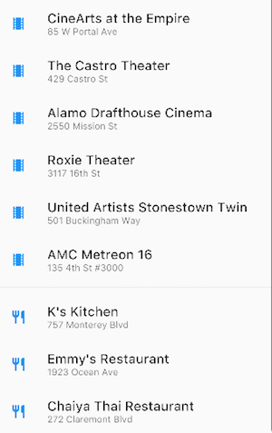
Widget _buildList() {
  return ListView(
    children: [
      _tile('CineArts at the Empire', '85 W Portal Ave', Icons.theaters),
      _tile('The Castro Theater', '429 Castro St', Icons.theaters),
      _tile('Alamo Drafthouse Cinema', '2550 Mission St', Icons.theaters),
      _tile('Roxie Theater', '3117 16th St', Icons.theaters),
      _tile('United Artists Stonestown Twin', '501 Buckingham Way',
          Icons.theaters),
      _tile('AMC Metreon 16', '135 4th St #3000', Icons.theaters),
      const Divider(),
      _tile('K\'s Kitchen', '757 Monterey Blvd', Icons.restaurant),
      _tile('Emmy\'s Restaurant', '1923 Ocean Ave', Icons.restaurant),
      _tile(
          'Chaiya Thai Restaurant', '272 Claremont Blvd', Icons.restaurant),
      _tile('La Ciccia', '291 30th St', Icons.restaurant),
    ],
  );
}

ListTile _tile(String title, String subtitle, IconData icon) {
  return ListTile(
    title: Text(title,
        style: const TextStyle(
          fontWeight: FontWeight.w500,
          fontSize: 20,
        )),
    subtitle: Text(subtitle),
    leading: Icon(
      icon,
      color: Colors.blue[500],
    ),
  );
}
Stack
可以使用 Stack 在基础 widget(通常是图片)上排列 widget,
widget 可以完全或者部分覆盖基础 widget。
摘要 (Stack)
-
用于覆盖另一个 widget
-
子列表中的第一个 widget 是基础 widget;后面的子项覆盖在基础 widget 的顶部
-
Stack的内容是无法滚动的 -
你可以剪切掉超出渲染框的子项
示例 (Stack)
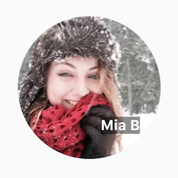
在 CircleAvatar 的上面使用 Stack 覆盖 Container
(在透明的黑色背景上展示它的 Text)。
Stack 使用 alignment 属性和 Alignment 让文本偏移。
App 源码: card_and_stack
Widget _buildStack() {
  return Stack(
    alignment: const Alignment(0.6, 0.6),
    children: [
      const CircleAvatar(
        backgroundImage: AssetImage('images/pic.jpg'),
        radius: 100,
      ),
      Container(
        decoration: const BoxDecoration(
          color: Colors.black45,
        ),
        child: const Text(
          'Mia B',
          style: TextStyle(
            fontSize: 20,
            fontWeight: FontWeight.bold,
            color: Colors.white,
          ),
        ),
      ),
    ],
  );
}
Card
Material 库 中的 Card 包含相关有价值的信息,几乎可以由任何 widget 组成,但是通常和 ListTile 一起使用。
Card 只有一个子项,这个子项可以是列、行、列表、网格或者其他支持多个子项的 widget。默认情况下,Card 的大小是 0x0 像素。你可以使用 SizedBox 控制 card 的大小。
在 Flutter 中,Card 有轻微的圆角和阴影来使它具有 3D 效果。改变 Card 的 elevation 属性可以控制阴影效果。例如,把 elevation 设置为 24,可以从视觉上更多的把 Card 抬离表面,使阴影变得更加分散。关于支持的 elevation 的值的列表,可以查看 Material guidelines 中的 Elevation。使用不支持的值则会使阴影无效。
摘要 (Card)
-
实现一个 Material card
-
用于呈现相关有价值的信息
-
接收单个子项,但是子项可以是
Row、Column或者其他可以包含列表子项的 widget -
显示圆角和阴影
-
Card的内容无法滚动 -
来自 Material 库
示例 (Card)
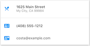
Widget _buildCard() {
  return SizedBox(
    height: 210,
    child: Card(
      child: Column(
        children: [
          ListTile(
            title: const Text(
              '1625 Main Street',
              style: TextStyle(fontWeight: FontWeight.w500),
            ),
            subtitle: const Text('My City, CA 99984'),
            leading: Icon(
              Icons.restaurant_menu,
              color: Colors.blue[500],
            ),
          ),
          const Divider(),
          ListTile(
            title: const Text(
              '(408) 555-1212',
              style: TextStyle(fontWeight: FontWeight.w500),
            ),
            leading: Icon(
              Icons.contact_phone,
              color: Colors.blue[500],
            ),
          ),
          ListTile(
            title: const Text('costa@example.com'),
            leading: Icon(
              Icons.contact_mail,
              color: Colors.blue[500],
            ),
          ),
        ],
      ),
    ),
  );
}
ListTile
ListTile 是 Material 库 中专用的行 widget,它可以很轻松的创建一个包含三行文本以及可选的行前和行尾图标的行。
ListTile 在 Card 或者 ListView 中最常用,但是也可以在别处使用。
摘要 (ListTile)
-
一个可以包含最多 3 行文本和可选的图标的专用的行
-
比
Row更少的配置,更容易使用 -
来自 Material 库
示例 (ListTile)
Constraints
To fully understand Flutter’s layout system, you need to learn how Flutter positions and sizes the components in a layout. For more information, see Understanding constraints.
视频
下面的视频是 Flutter in Focus 系列的一部分,解释了 Stateless 和 Stateful 的 widget。
每周 Widget 系列 的每一集都会介绍一个 widget。其中也包括一些布局的 widget。
Flutter Widget of the Week playlist
其他资源
当写布局代码时,下面的资源可能会帮助到你。
-
Layout 教程)
学习如何构建布局。 -
核心 Widget 目录
描述了 Flutter 中很多可用的 widget。 -
给 Web 开发者的 Flutter 指南
对那些熟悉 web 开发的人来说,这页将 HTML/CSS 的功能映射到 Flutter 特性上。 -
Flutter Gallery 应用和 代码仓库
Demo app 展示了很多 Material Design widget 和其他的 Flutter 特性。 -
Flutter API 文档
所有 Flutter 库的参考文档。 -
处理边界约束 (Box constraints) 的问题
讨论 widget 是如何受渲染框限制的。 -
在 Flutter 中添加资源和图片
解释在你的 app 中如何添加图片和其他资源。 -
Flutter 从 0 到 1
一位开发者第一次写 Flutter app 的经验分享文章。