不同平台操作体验的差异和适配
适配哲学
平台适配通常有两种情形:
-
操作系统所特有的操作体验(例如文本编辑和滚动)。如果操作体验与操作系统不一致,则通常会被认为是“错误的”。
-
使用 OEM 提供的 SDK 实现的功能体验(例如 iOS 常使用的选项卡, Android 使用 android.app.AlertDialog 显示一个提示窗口)。
本文囊括了 Flutter 为解决情形 1 而提供的覆盖 Android 和 iOS 的自动适配。
对于情形 2,Flutter 提供了一些工具可以生成符合平台习惯的体验,但是不会根据平台自动适配,需要根据 App 设计来手工选择。更多有关的讨论,请访问 issue #8410 和这个文档 定义 Material/Cupertino widget 适配问题
如果一个应用需要在 Android 和 iOS 不同架构上使用相同的代码,请参阅 platform_design 这份代码示例。
</aside>
页面导航
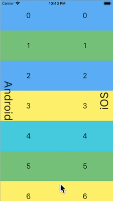
Flutter 分别为 Android 和 iOS 提供了各自平台的导航模式,并根据当前平台自动适配导航转场动画。
导航转场动画
Android 平台,默认提供的 Navigator.push()
转场动画模仿了 startActivity() 的动画,即一种自下而上的动画效果。
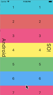
iOS 平台:
-
iOS 的
Navigator.push()API 提供了 iOS 上的 Show 转场动画(也被称为 Push 转场动画),即根据语言的方向设置,执行一种从后到前的滚动动画效果。在显示新页面的时候,原来的页面也会沿着相同的方向进行视差滚动。 -
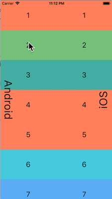
当显示一个页面,且
PageRoute.fullscreenDialog是 true 的时候, iOS 提供了另外一种自下而上的动画效果。这个动画通常被用在展示全屏模态页,也被称为 iOS 上的 Present 转场动画或 Modal 转场动画。
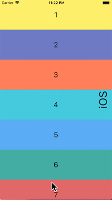
不同平台的转场动画细节
Android 平台上,根据你的操作系统版本差异,有两种不同的转场动画:
当在 iOS 平台上使用 Push 转场特效的时候,
Flutter 内置的 CupertinoNavigationBar
和 CupertinoSliverNavigationBar
会自动的给当前页下一页的子组件使用正确的动画效果(CupertinoNavigationBar 或者 CupertinoSliverNavigationBar)。
返回导航
Android 平台,通常操作系统的返回按钮触发的事件会发给 Flutter,并弹出 WidgetsApp 路由的最顶端。
iOS 平台,从屏幕边缘的轻扫手势会弹出路由的最顶端。
滚动
滚动是不同平台提供独有体验非常重要的一环, Flutter 会根据当前的平台自动适配滚动体验。
物理仿真
Android 和 iOS 平台都提供了非常复杂的滚动物理仿真,因而很难用语言来描述。通常来说, iOS 的滚动通常提供更多的分量和动态的阻力;而 Android 则更多的使用静态的阻力。所以,iOS 随着滚动慢慢的达到高速,且不会突然的停止,而且在慢速的时候显得更顺滑。

滚动边界行为
Android 平台,滚动达到边界的时候,会显示 滚动灰色指示 (具体颜色根据 Material 主题而有所不同)。
iOS 平台,滚动达到边界的时候,会显示一个 滚动边界 的弹簧效果。
动量
iOS 平台,不停的按相同方向滚动会产生动量叠加,从而连续滚动速度会越来越快。在 Android 平台上没有对应的行为。
返回顶部
iOS 平台,点击操作系统的状态栏,主要的滚动条控制器会滚动到顶部。 Android 没有对应的行为。
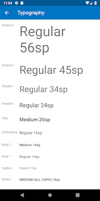
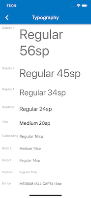
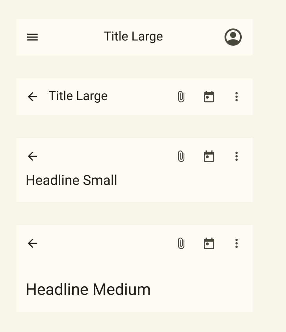
排版
当使用 Material package 的时候,排版会根据平台自动使用对应的字体。 Android 平台会使用 Roboto 字体,而 iOS 则会使用系统自带的 San Francisco 字体。
当使用 Cupertino 包的时候,默认主题 会一直使用 San Francisco 字体。
San Francisco 字体的授权限制了它只能被用在运行于 iOS、macOS 和 tvOS 平台上的软件。因此当运行在 Android 平台的时候,即使强制覆盖系统平台为 iOS 或者使用 Cupertino 默认主题,都会使用对应的替代字体。
你可以选择将 Material widgets 的文本样式适配到 iOS 的默认文本样式。你可以在 UI 组件部分 看到特定组件的例子。
图标
当使用 Material 包的时候,根据平台不同,图标的具体样式会有差别。举例来说,更多按钮的图标,Android 上是竖直的三个点而 iOS 是横着的三个点;退回按钮,iOS 是一个简单的 V 型标记,而 Android 平台,V 型标记有个短横线。


The material library also provides a set of platform-adaptive icons through Icons.adaptive.
触摸反馈
Material 和 Cupertino 包在特定场景下都会自动触发符合平台特点的触摸反馈。
例如,在文本输入框控件里面长按选中单词会在 Android 设备上会触发震动,而 iOS 不会。
在 iOS 滚动选择器项目列表,会触发一个很轻的敲击音效,而 Android 则不会。
文本编辑
Flutter 会根据当前平台来适配正确的文本编辑体验。
键盘手势导航
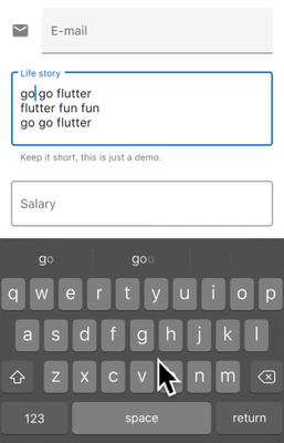
Android 平台,在虚拟键盘空格键上可以通过左右轻扫来移动光标, Material 和 Cupertino 的文本输入框控件都支持该特性。
iOS 设备提供了 3D Touch 兼容,通过在虚拟键盘上使用长按并拖拽手势可以任意方向移动光标。 Material 和 Cupertino 都对这个功能提供了支持。
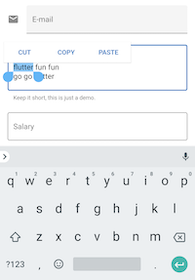
文本选中工具栏
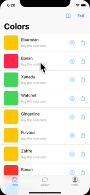
在 Android 平台上使用 Material,在文本输入框里面选中文本会显示一个 Android 风格的文本选中工具栏。
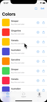
在 iOS 平台上使用 Material 或者在两个平台上都使用 Cupertino,在文本输入框里面选中文本会展示一个 iOS 风格的文本选中工具栏。
点击手势
在 Android 平台使用 Material,在文本控件中点击会移动光标到点击处。
同时,光标会有一个可移动的把手,随后可以通过这个把手移动光标。
在 iOS 平台使用 Material 或者在两个平台都使用 Cupertino,在文本空间中点击,会把光标移动到点击处最近的单词末尾。
在 iOS 平台上,光标是没有把手的。
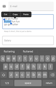
长按手势
在 Android 平台使用 Material,在单词上长按会选中单词,并在释放长按的时候显示文本选中工具栏。
在 iOS 平台使用 Material 或者在两个平台都使用 Cupertino,长按会把光标放置到长按的位置,并在释放长按的时候显示文本选中工具栏。
长按并拖放手势
在 Android 平台上使用 Material,长按并拖拽会选中更多单词。
在 iOS 平台使用 Material 或者在两个平台都使用 Cupertino,长按并拖拽会移动光标。
双击手势
Android 和 iOS 平台上,双击选中一个单词都会收到双击手势事件,并显示文本选中工具栏。
UI components
This section includes preliminary recommendations on how to adapt Material widgets to deliver a natural and compelling experience on iOS. Your feedback is welcomed on issue #8427.
Widgets with .adaptive() constructors
Several widgets support .adaptive() constructors.
The following table lists these widgets.
Adaptive constructors substitute the corresponding Cupertino components
when the app is run on an iOS device.
Widgets in the following table are used primarily for input, selection, and to display system information. Because these controls are tightly integrated with the operating system, users have been trained to recognize and respond to them. Therefore, we recommend that you follow platform conventions.
| Material Widget | Cupertino Widget | Adaptive Constructor |
|---|---|---|
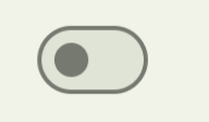 Switch
|
 CupertinoSwitch
|
Switch.adaptive() |
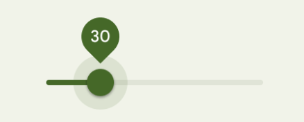 Slider
|
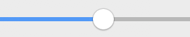 CupertinoSlider
|
Slider.adaptive() |
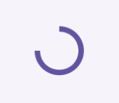 CircularProgressIndicator
|
 CupertinoActivityIndicator
|
CircularProgressIndicator.adaptive() |
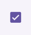 Checkbox
|
 CupertinoCheckbox
|
Checkbox.adaptive() |
 Radio
|
 CupertinoRadio
|
Radio.adaptive() |
Top app bar and navigation bar
Since Android 12, the default UI for top app bars follows the design guidelines defined in Material 3. On iOS, an equivalent component called “Navigation Bars” is defined in Apple’s Human Interface Guidelines (HIG).
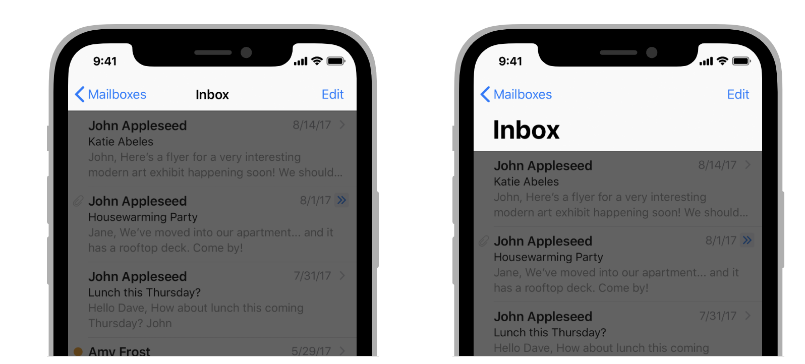
Certain properties of app bars in Flutter apps should be adapted,
like system icons and page transitions.
These are already automatically adapted when using
the Material AppBar and SliverAppBar widgets.
You can also further customize the properties of these widgets to better
match iOS platform styles, as shown below.
// Map the text theme to iOS styles
TextTheme cupertinoTextTheme = TextTheme(
    headlineMedium: CupertinoThemeData()
        .textTheme
        .navLargeTitleTextStyle
         // fixes a small bug with spacing
        .copyWith(letterSpacing: -1.5),
    titleLarge: CupertinoThemeData().textTheme.navTitleTextStyle)
...

// Use iOS text theme on iOS devices
ThemeData(
      textTheme: Platform.isIOS ? cupertinoTextTheme : null,
      ...
)
...

// Modify AppBar properties
AppBar(
        surfaceTintColor: Platform.isIOS ? Colors.transparent : null,
        shadowColor: Platform.isIOS ? CupertinoColors.darkBackgroundGray : null,
        scrolledUnderElevation: Platform.isIOS ? .1 : null,
        toolbarHeight: Platform.isIOS ? 44 : null,
        ...
      ),
But, because app bars are displayed alongside other content in your page, it’s only recommended to adapt the styling so long as its cohesive with the rest of your application. You can see additional code samples and a further explanation in the GitHub discussion on app bar adaptations.
Bottom navigation bars
Since Android 12, the default UI for bottom navigation bars follow the design guidelines defined in Material 3. On iOS, an equivalent component called “Tab Bars” is defined in Apple’s Human Interface Guidelines (HIG).
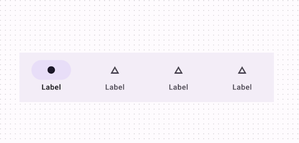
Since tab bars are persistent across your app, they should match your own branding. However, if you choose to use Material’s default styling on Android, you might consider adapting to the default iOS tab bars.
To implement platform-specific bottom navigation bars,
you can use Flutter’s NavigationBar widget on Android
and the CupertinoTabBar widget on iOS.
Below is a code snippet you can
adapt to show a platform-specific navigation bars.
final Map<String, Icon> _navigationItems = {
    'Menu': Platform.isIOS ? Icon(CupertinoIcons.house_fill) : Icon(Icons.home),
    'Order': Icon(Icons.adaptive.share),
  };

...

Scaffold(
  body: _currentWidget,
  bottomNavigationBar: Platform.isIOS
          ? CupertinoTabBar(
              currentIndex: _currentIndex,
              onTap: (index) {
                setState(() => _currentIndex = index);
                _loadScreen();
              },
              items: _navigationItems.entries
                  .map<BottomNavigationBarItem>(
                      (entry) => BottomNavigationBarItem(
                            icon: entry.value,
                            label: entry.key,
                          ))
                  .toList(),
            )
          : NavigationBar(
              selectedIndex: _currentIndex,
              onDestinationSelected: (index) {
                setState(() => _currentIndex = index);
                _loadScreen();
              },
              destinations: _navigationItems.entries
                  .map<Widget>((entry) => NavigationDestination(
                        icon: entry.value,
                        label: entry.key,
                      ))
                  .toList(),
            ));
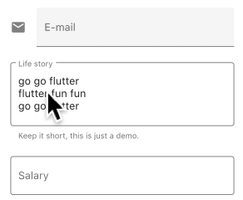
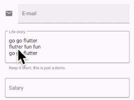
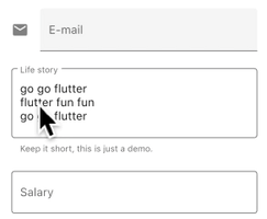
Text fields
Since Android 12, the default UI of text fields follows the design guidelines defined in Material 3 (M3). On iOS, Apple’s Human Interface Guidelines (HIG) define an equivalent component.
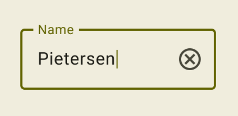
Since text fields require user input,
their design should follow platform conventions.
To implement a platform-specific TextField
in Flutter, you can adapt the styling of the
Material TextField.
Widget _createAdaptiveTextField() {
  final _border = OutlineInputBorder(
    borderSide: BorderSide(color: CupertinoColors.lightBackgroundGray),
  );

  final iOSDecoration = InputDecoration(
    border: _border,
    enabledBorder: _border,
    focusedBorder: _border,
    filled: true,
    fillColor: CupertinoColors.white,
    hoverColor: CupertinoColors.white,
    contentPadding: EdgeInsets.fromLTRB(10, 0, 0, 0),
  );

  return Platform.isIOS
      ? SizedBox(
          height: 36.0,
          child: TextField(
            decoration: iOSDecoration,
          ),
        )
      : TextField();
}
To learn more about adapting text fields, check out the GitHub discussion on text fields. You can leave feedback or ask questions in the discussion.
Alert dialog
Since Android 12, the default UI of alert dialogs (also known as a “basic dialog”) follows the design guidelines defined in Material 3 (M3). On iOS, an equivalent component called “alert” is defined in Apple’s Human Interface Guidelines (HIG).
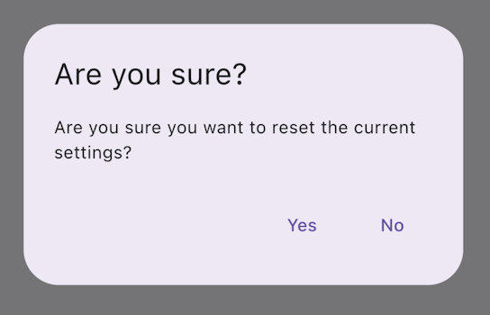
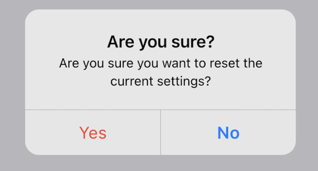
Since alert dialogs are often tightly integrated with the operating system, their design generally needs to follow the platform conventions. This is especially important when a dialog is used to request user input about security, privacy, and destructive operations (e.g., deleting files permanently). As an exception, a branded alert dialog design can be used on non-critical user flows to highlight specific information or messages.
To implement platform-specific alert dialogs,
you can use Flutter’s AlertDialog widget on Android
and the CupertinoAlertDialog widget on iOS. Below is a code snippet you can
adapt to show a platform-specific alert dialog.
void _showAdaptiveDialog(
  context, {
  required Text title,
  required Text content,
  required List<Widget> actions,
}) {
  Platform.isIOS || Platform.isMacOS
      ? showCupertinoDialog<String>(
          context: context,
          builder: (BuildContext context) => CupertinoAlertDialog(
            title: title,
            content: content,
            actions: actions,
          ),
        )
      : showDialog(
          context: context,
          builder: (BuildContext context) => AlertDialog(
            title: title,
            content: content,
            actions: actions,
          ),
        );
}
To learn more about adapting alert dialogs, check out the GitHub discussion on dialog adaptations. You can leave feedback or ask questions in the discussion.